
Manuel Cargaleiro — Geometry, Colour and Rhythm
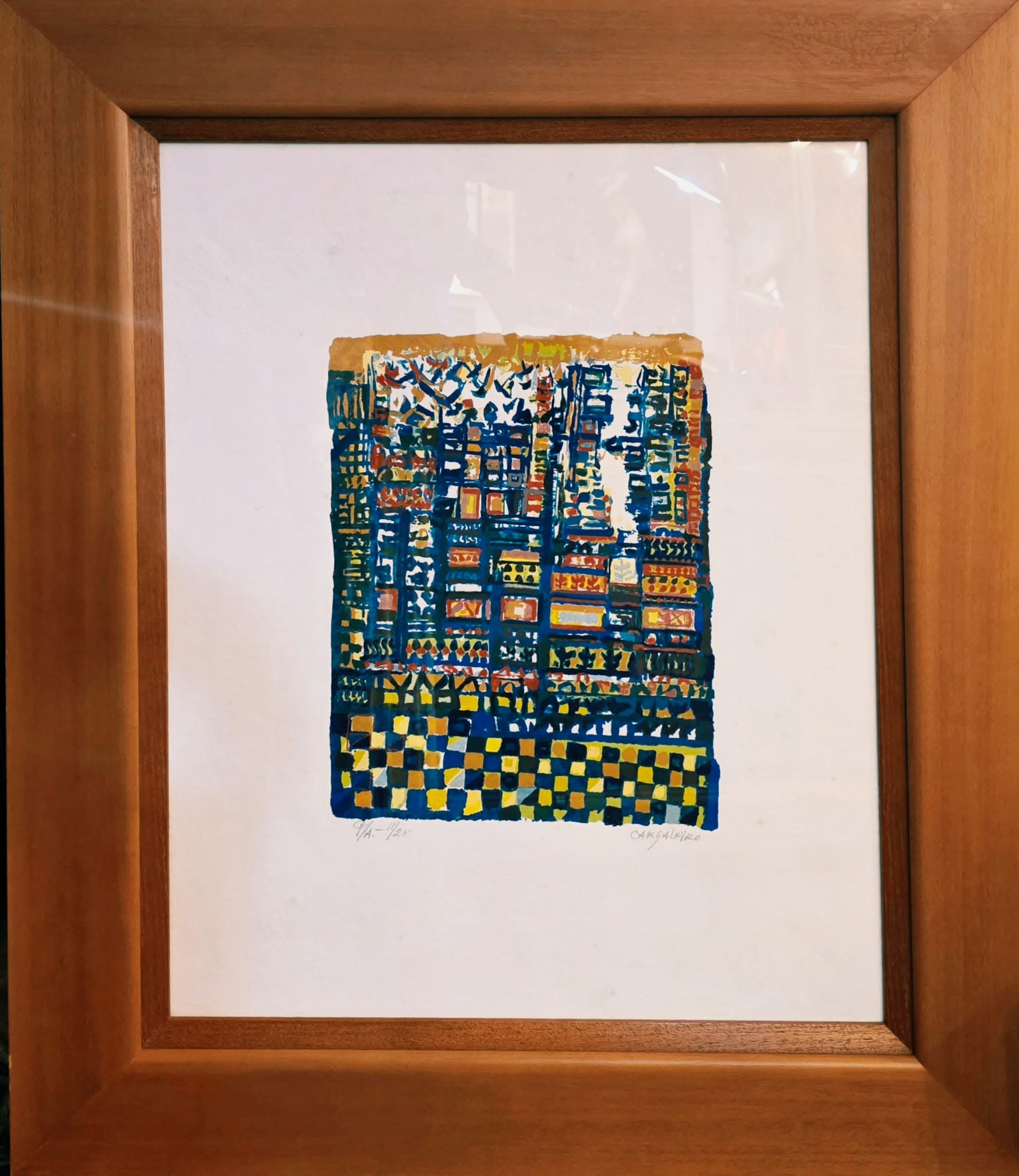
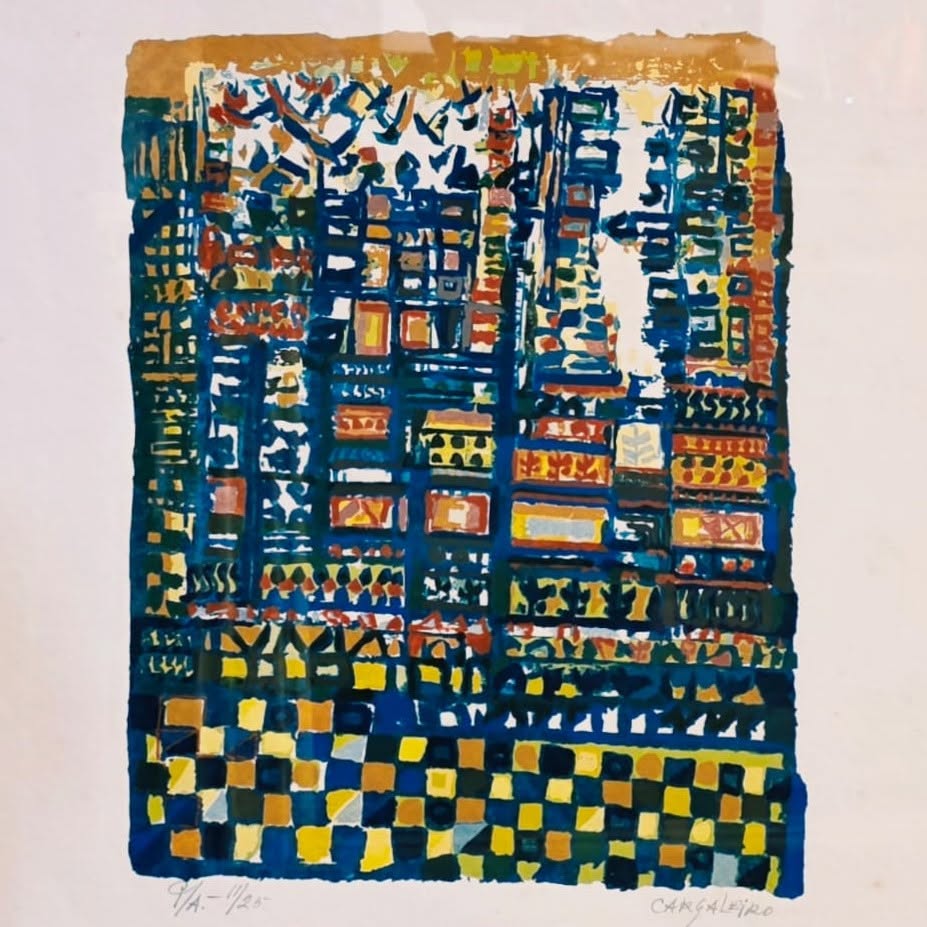
Some works do more than simply occupy a space: they create a place of their own. In this silkscreen by Manuel Cargaleiro, marked A/P 11/25 — Artist’s Proof, number 11 from an edition of 25, I find precisely that ability to transform colour, form and rhythm into a true imaginary architecture.
Blue, so deeply associated with Cargaleiro’s visual universe, structures the entire composition. It draws the grids, defines the different fields and guides the eye through an almost endless succession of small visual events. Over this framework, luminous yellows, ochres, reds and touches of white emerge in a rhythm that brings to mind both the Portuguese azulejo tradition and the spontaneity of a city reconstructed through memory.
Despite its geometry, nothing here feels truly rigid. The lines retain the gesture of the hand, the forms seem to vibrate, and the squares resist mathematical perfection. For me, it is precisely in this tension between order and freedom that much of Cargaleiro’s strength lies: there is discipline, but also joy, improvisation and a remarkable sense of musicality.
I particularly like the way the composition becomes denser towards the centre while opening up and breathing in other areas. It can resemble a façade, a mosaic, a vertical city or even a visual score — perhaps it is all of these at once.
This is one of those works that we immediately recognise as belonging to Manuel Cargaleiro’s universe: Mediterranean in its light, Portuguese in its memory, and entirely universal in its visual language.
It is a silkscreen that reveals more details the longer I look at it. And that ongoing dialogue with a work of art is exactly what I look for when selecting a piece for the Batalha Collection.
€ 3.000,00
Related products
-
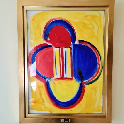
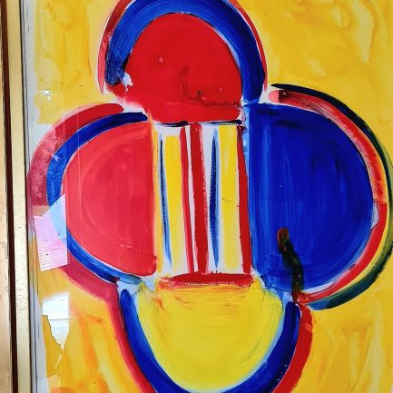
🎨✨ SIR TERRY FROST (1915-2003) ✨🎨
-
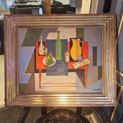
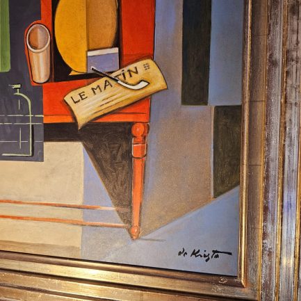
BÉLA DE KRISTO
-
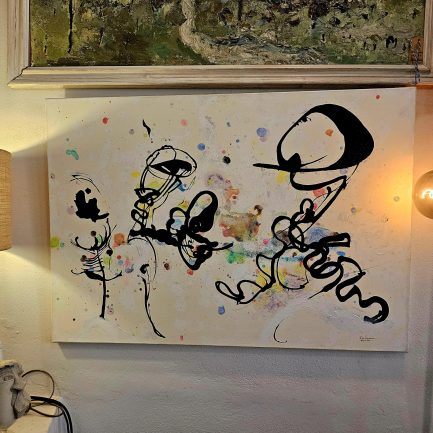
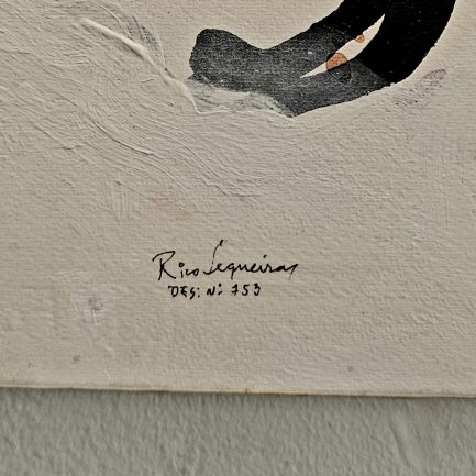
🎨✨ THE DANCE OF LINES ✨🖌️
-
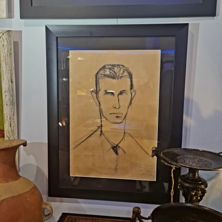
🖌️✨ STOCKLER ✨🖌️
-
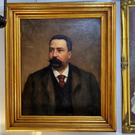
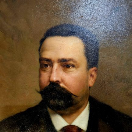
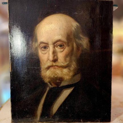
🎨 PORTRAIT OF A GENTLEMAN BY VELOSO SALGADO 👨🎨✨
-
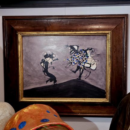
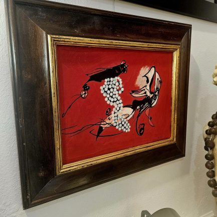
👨🎨💥🎨 RICO SEQUEIRA
-
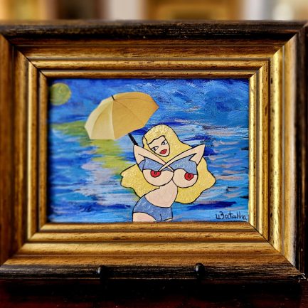
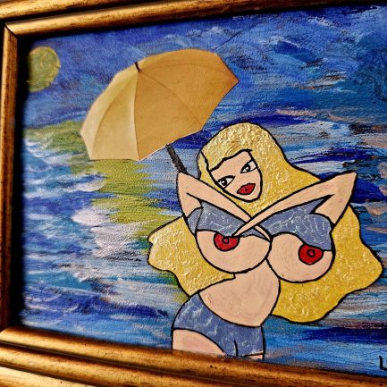
🌞 SUMMER LADY BY BATALHA 🌻
-
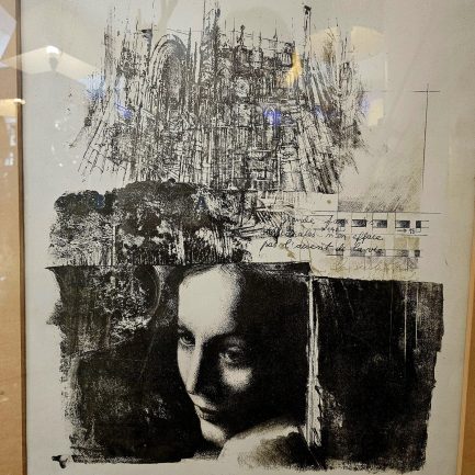
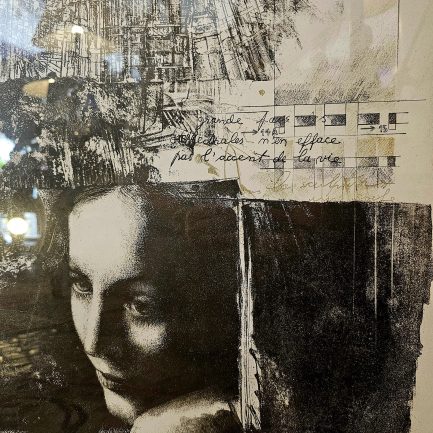
✨ REMEMBERING – LOURDES LEITE ✨
-
🌟 HUGUES MERLE 🌟
-
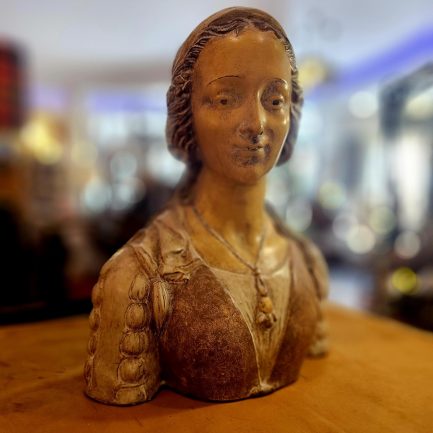
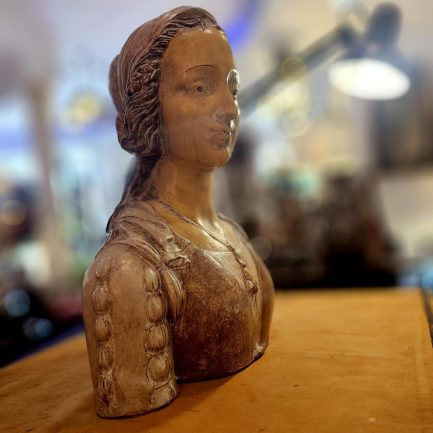
📜 RENAISSANCE WOMAN ✨
-
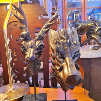
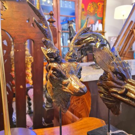
🦌🐗 SCULPTURE OF DEER AND WILD BOAR 🏺✨
-
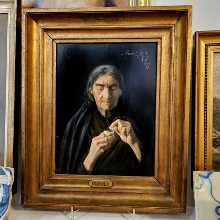
🌆 “FAITH” 🎭
